Intro
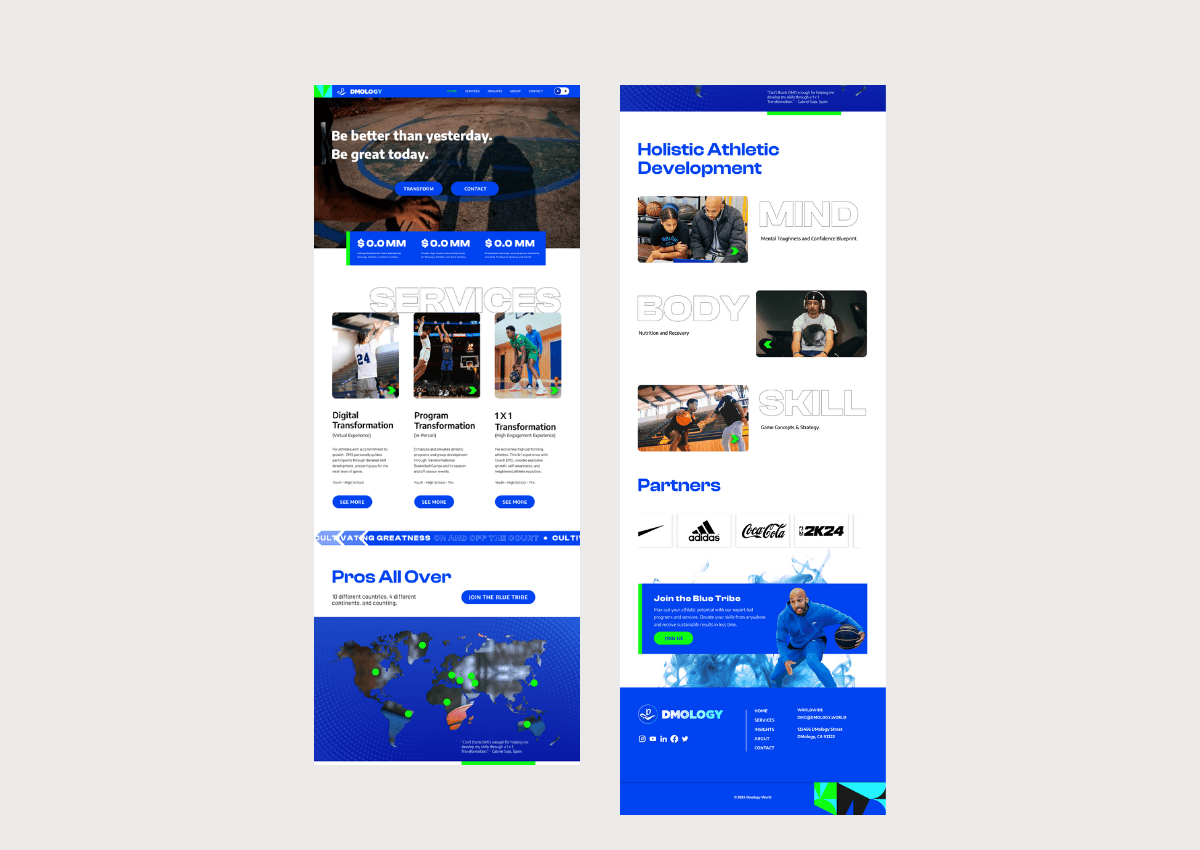
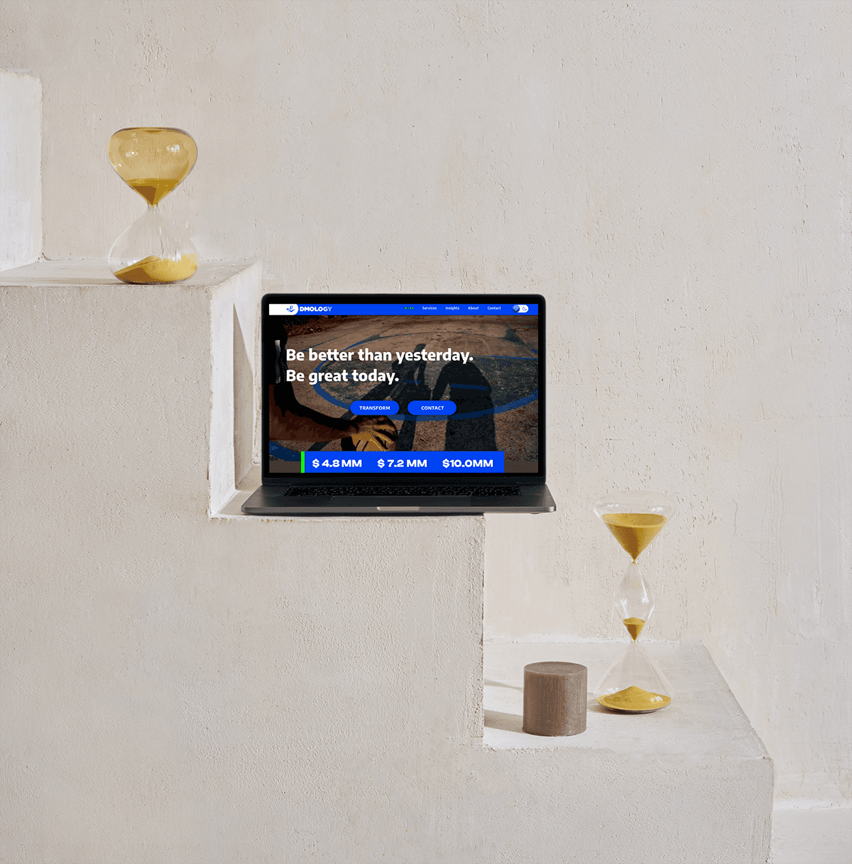
Redesigned Dmology’s homepage and core visual system to resolve usability, readability, and navigation issues in an existing DIY-built website. The original experience lacked clear hierarchy and made it difficult for users to understand the offering or know what action to take. My work focused on clarifying the user journey, strengthening information flow, and establishing a more modern, usable brand foundation. Improved layout structure, clearer visual hierarchy, and used more intuitive calls to action. Updated the brand direction to support legibility and scalability while working in partnership with another design agency, aligning design decisions with implementation constraints and cross-team collaboration. Evaluated dark mode versus light mode from a usability perspective, ultimately advocating for a light-mode solution to improve readability, navigation, and user comprehension across the site. Refined color system rooted in Dmology’s existing visual assets, elevating a rich blue into a primary brand anchor, supported by complementary green and turquoise tones for clarity and contrast. Figma to Wordpress.
Deliverables:
Website Design
Copywriting
Art Direction
UI/UX Design
Branding
Logo Design
Figma
Year
/
2024
Client
/
Dmology